upGrad is an online higher education platform providing industry-relevant programs in collaboration with top universities. It offers personalized support, career guidance and job opportunities for learners.
Introduction
upGrad's goal is to enable individuals to realize their full potential by embracing lifelong learning. To achieve this, they offer career-focused educational programs that are affordable, outcome-oriented, and easily accessible. By providing tools such as placement services, resume builders, mock interviews, face-to-face interactions with industry professionals, and hands-on work experience, upGrad strives to assist learners in achieving their desired career outcomes. Their programs can be accessed through the web, Android, and iOS platforms.
Problem
Since its inception in 2015, the product experience remained mostly stagnant, with newer features added onto the existing architecture. As a consequence, unintuitive patterns accumulated over time, impacting both user engagement and adoption rates for our latest initiatives. This was particularly concerning since it led to learners spending less time on the platform, which in turn affected their ability to achieve course-associated goals.
Evidence
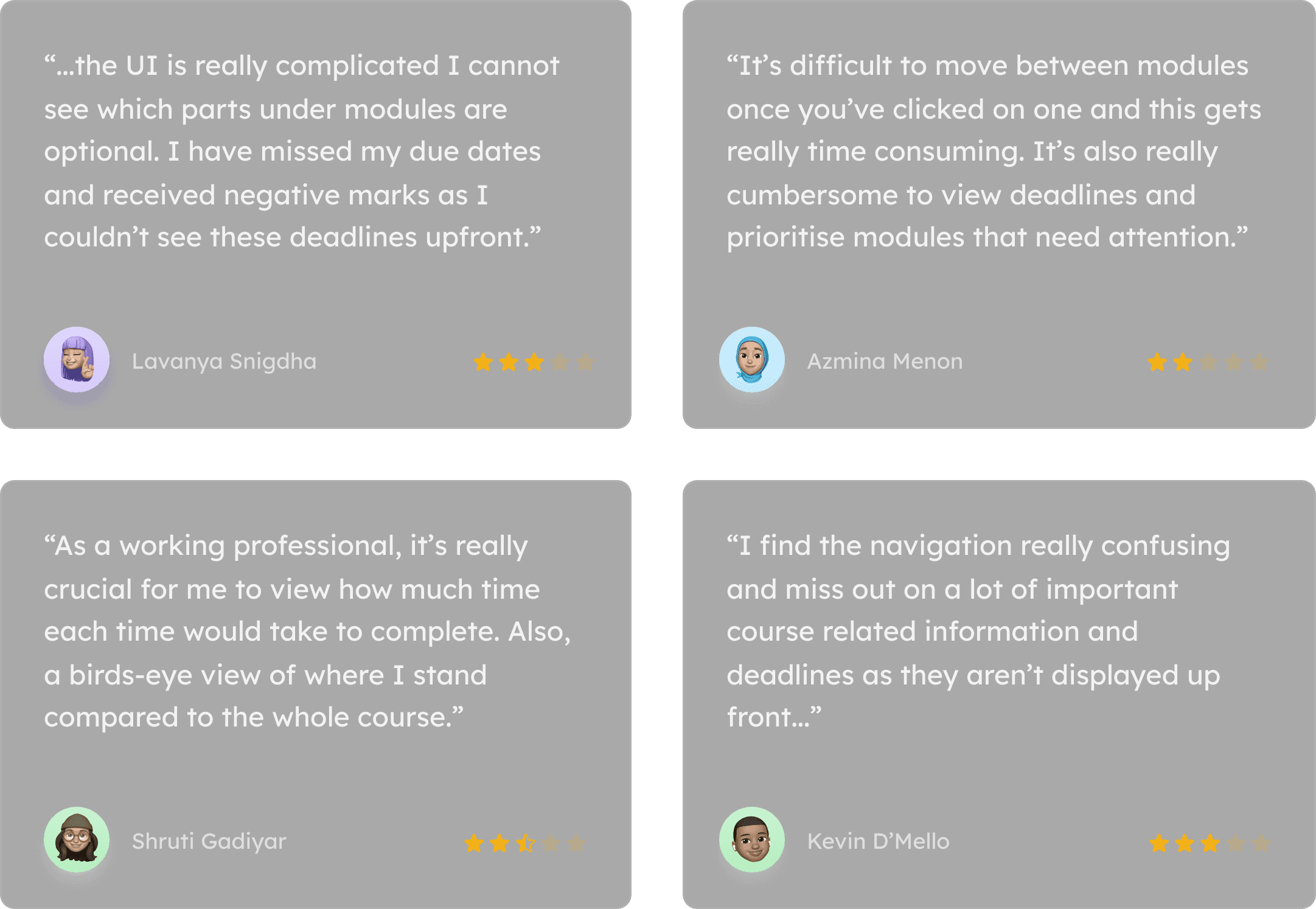
The need to address this issue was substantiated by learner feedback obtained through user interviews, surveys, and app store reviews. This feedback was further corroborated by corresponding data such as clickstreams, adoption rates, and session durations.
User Feedback
App Store Reviews — Avg. Rating ★3.3
Drop in User Engagement
Drop in Feature Discovery
Drop in User Retention
Approach
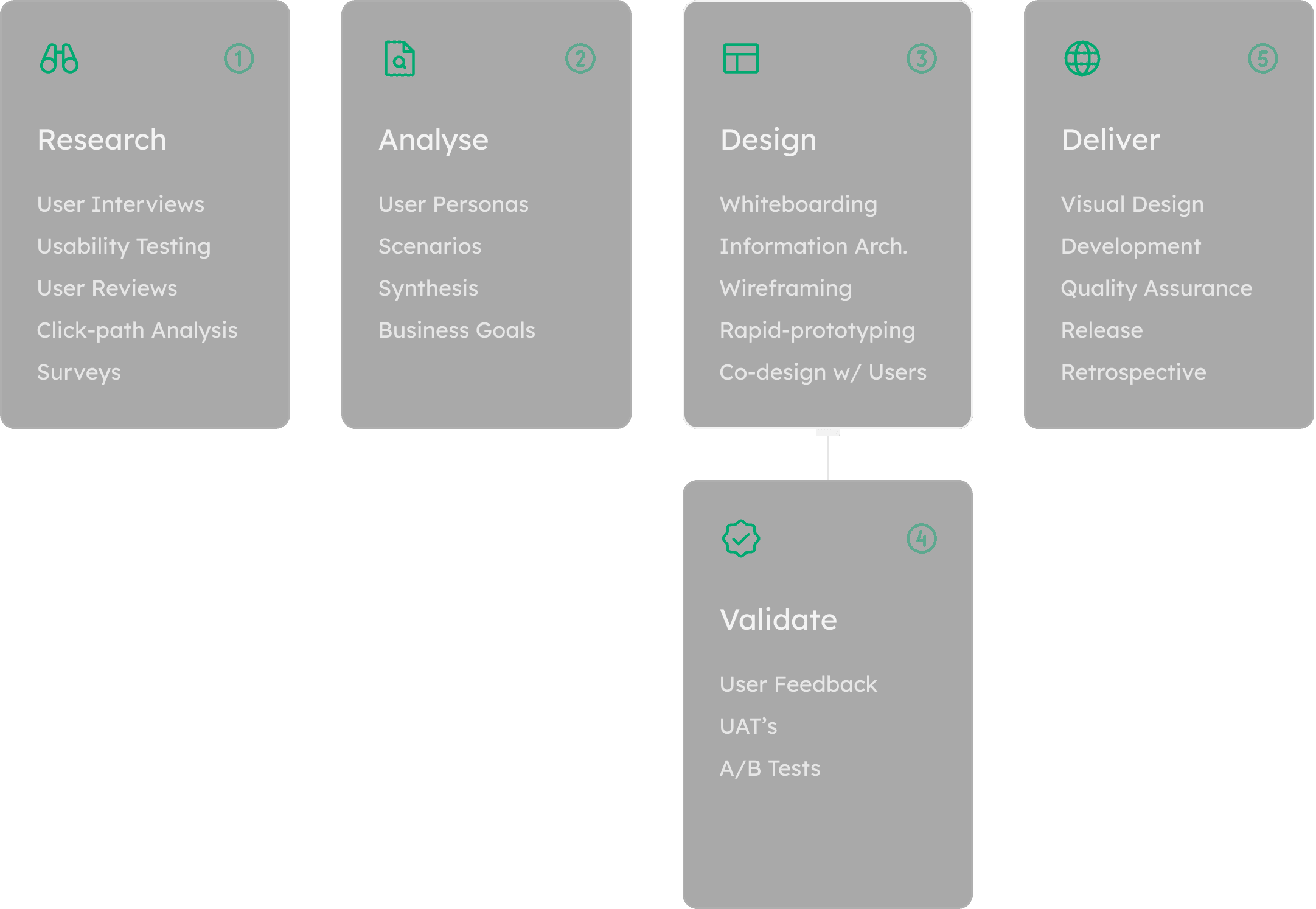
Process
The product development process involved extensive user research through surveys and interviews, which provided both qualitative and quantitative data. Co-designing with users during the design phase helped to improve turnaround time by building prototypes and validating them simultaneously. The user acceptance testing at the end of the process helped to identify and resolve any remaining issues.
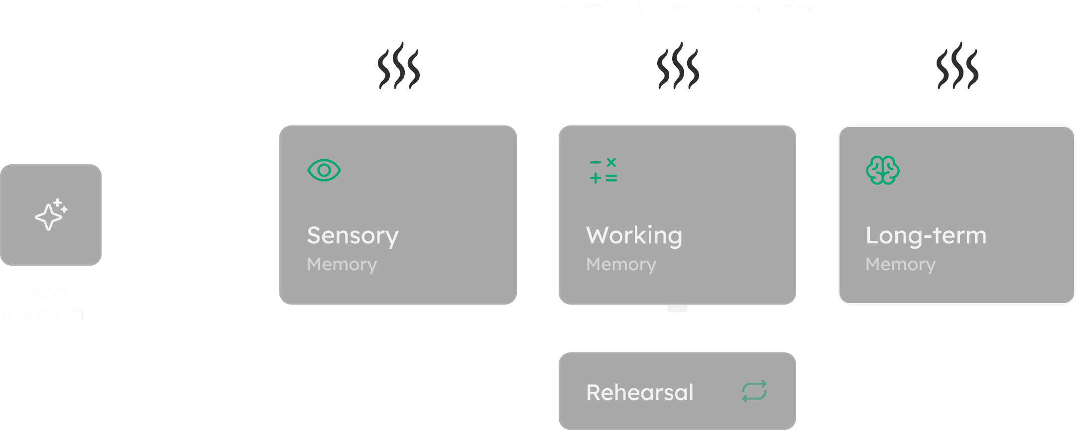
Memory Retention
Our UX research focused on the process of transferring novel information from sensory and working memory to long-term memory for better retention. The study found that the use of working examples and rehearsal significantly aids this transfer, leading to improved comprehension and long-term retention of learned concepts for users.
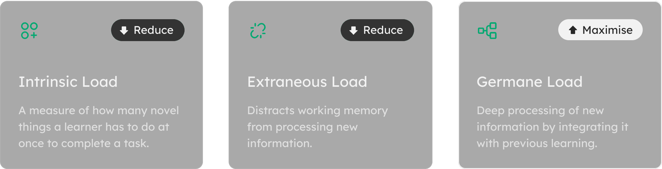
The Challenge
The amount of information that working memory can retain at a time is called cognitive load, and it has a limited capacity. To enhance the learning experience, the challenge was to avoid overloading the working memory with non-learning-related activities. Our hypothesis was that reducing cognitive overload and providing a guided flow would result in increased engagement and better learning outcomes for users.
Groundwork
Teaching Methodology
We adopted an approach where a lesson structure is integrated and includes various activities to solve a task, which can span an entire lesson or multiple lessons for project-based learning. The task serves as the overarching objective, and the activities are the individual steps taken to achieve it, promoting engagement and improving learning outcomes.

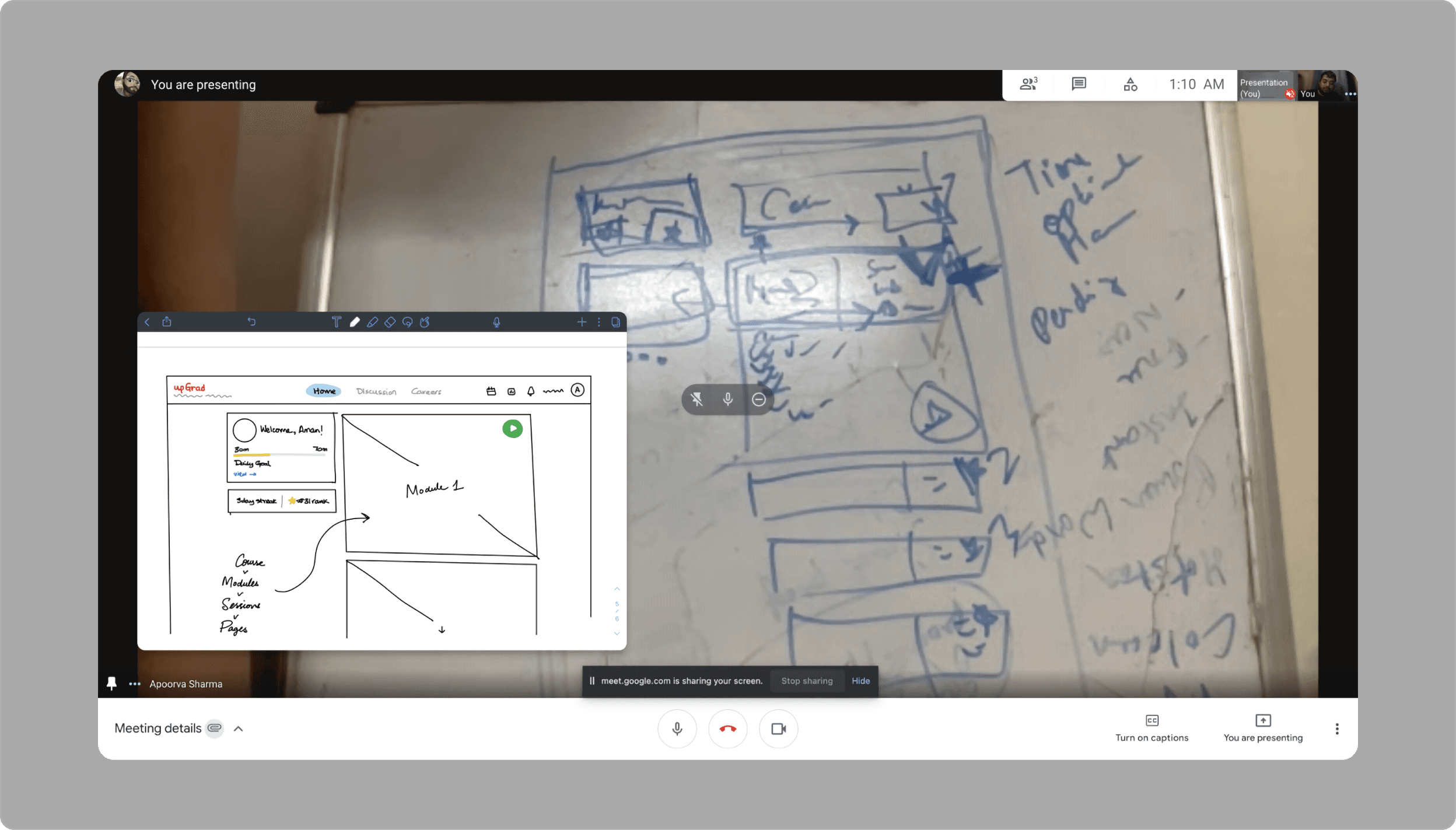
Whiteboarding
Whiteboarding proved pivotal in expediting issue resolution and meeting business objectives by facilitating collaboration between internal stakeholders and balancing user requirements during our redesign initiative.
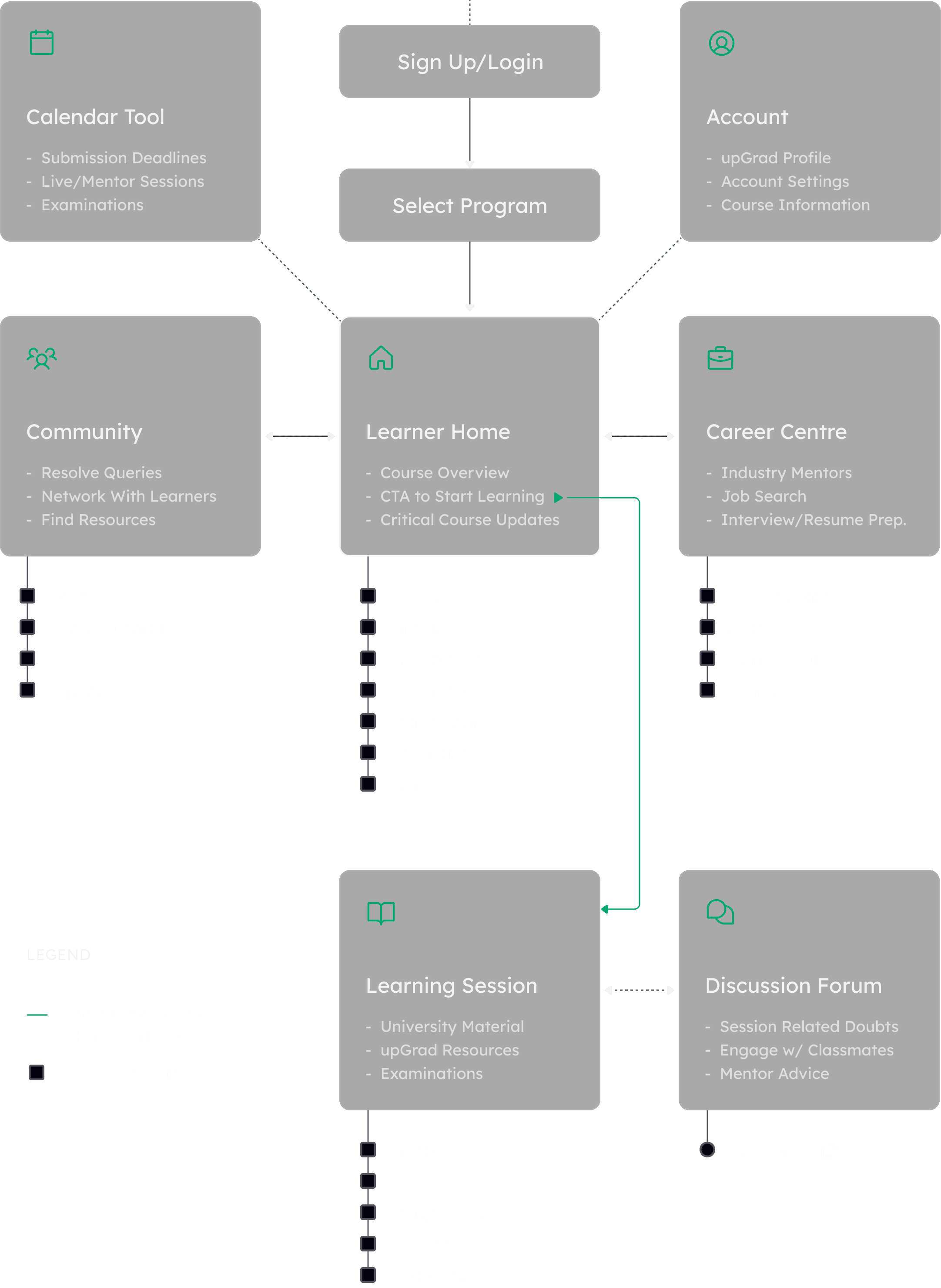
Information Architecture
We prioritized simplifying the user journey through our UX information architecture by decluttering the overall navigation, and emphasizing the bare essentials to improve findability, resulting in a more intuitive and user-friendly experience.
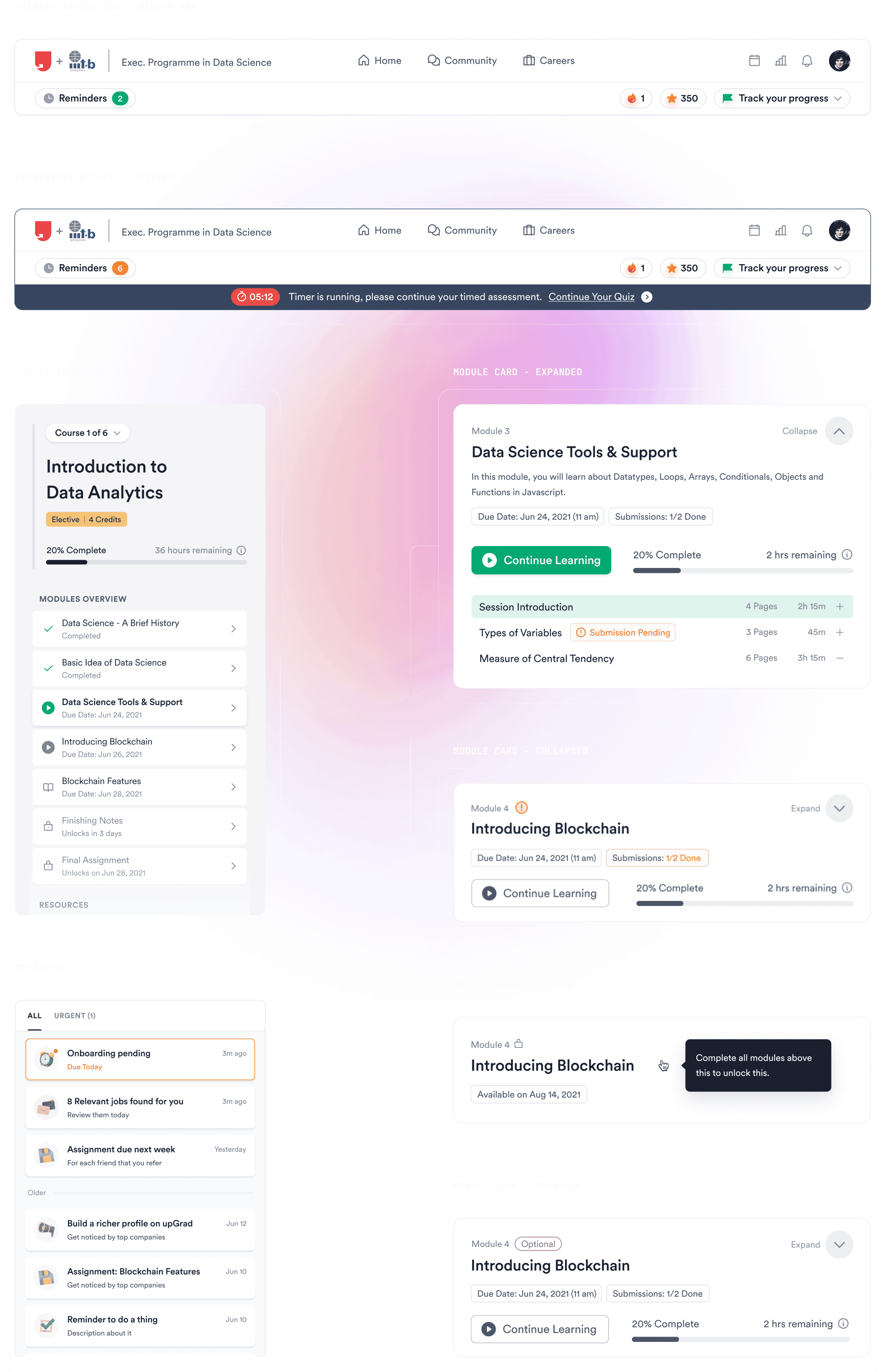
Solution
Simple, Rigorous, & Gratifying
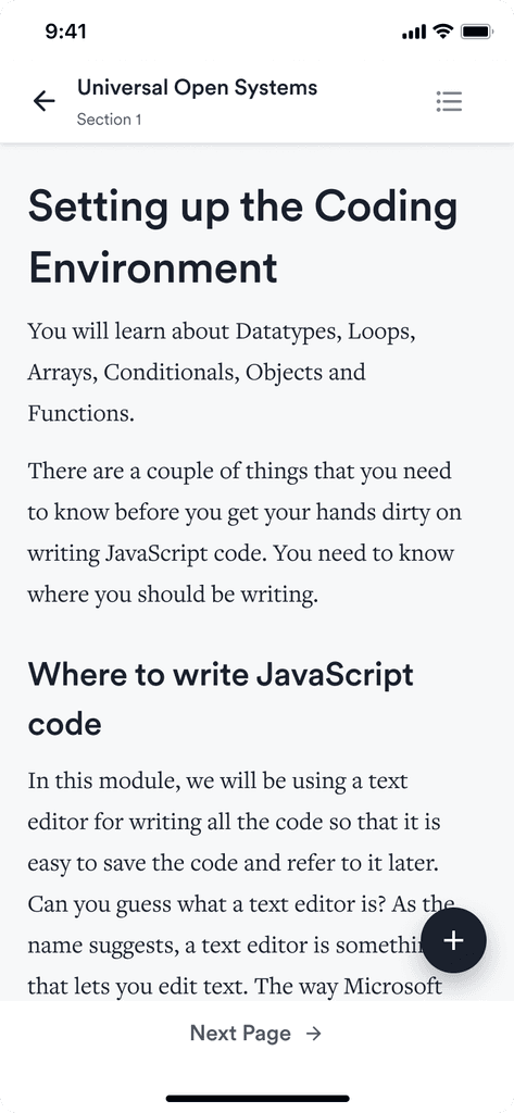
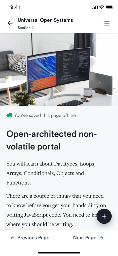
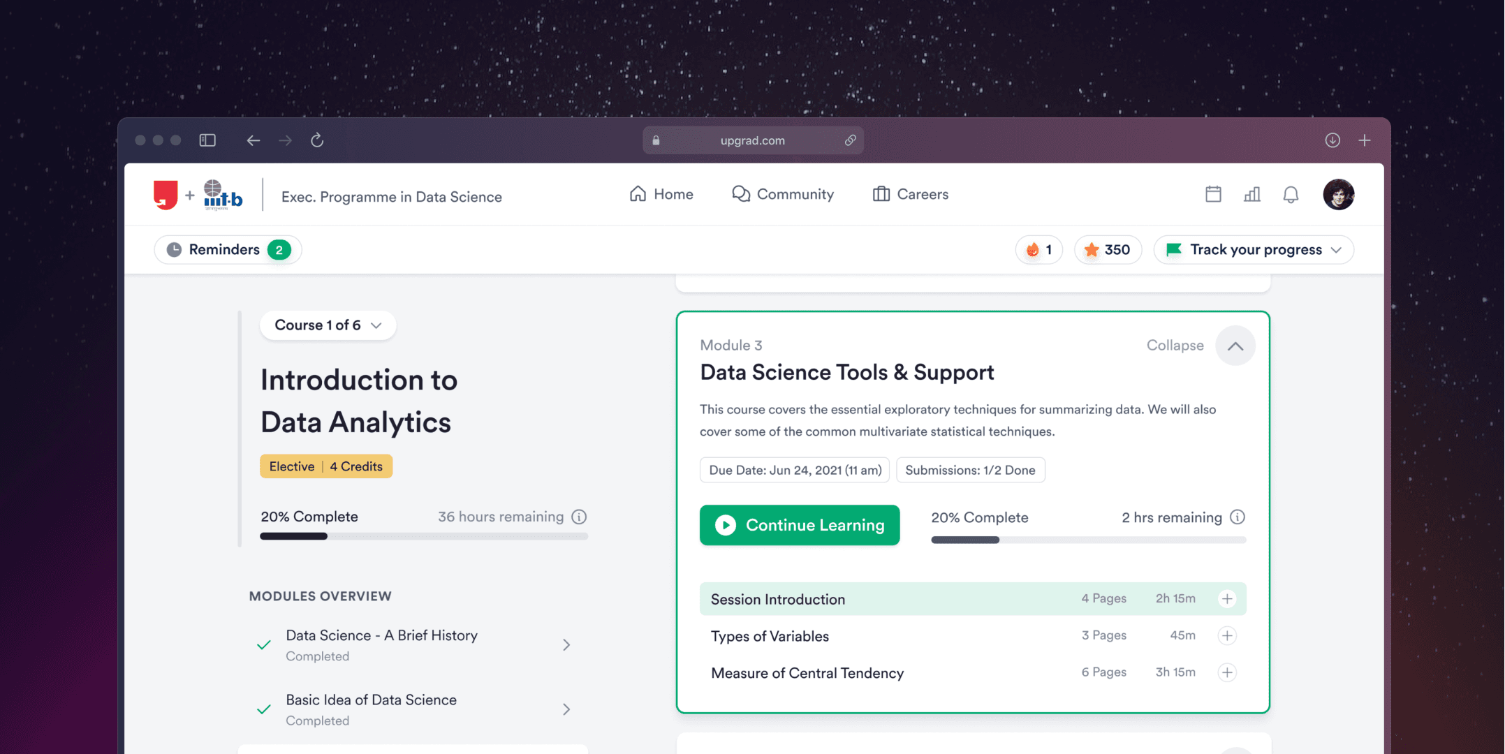
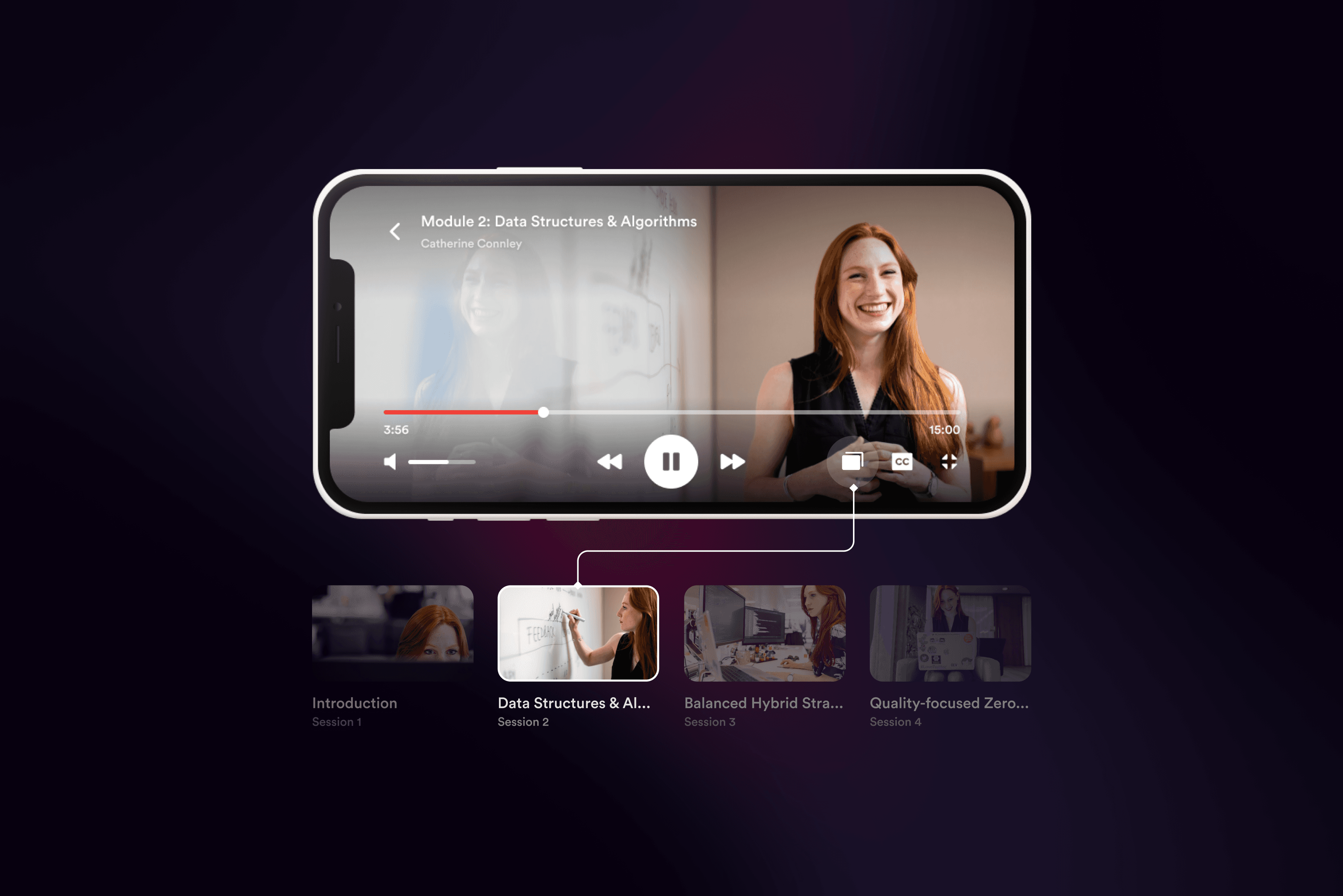
We aimed to make learning less daunting by dividing course content into micro-tasks with clear progress tracking. Course material was presented via bite-sized videos, quizzes, and supporting articles, aiding rigorous learning.
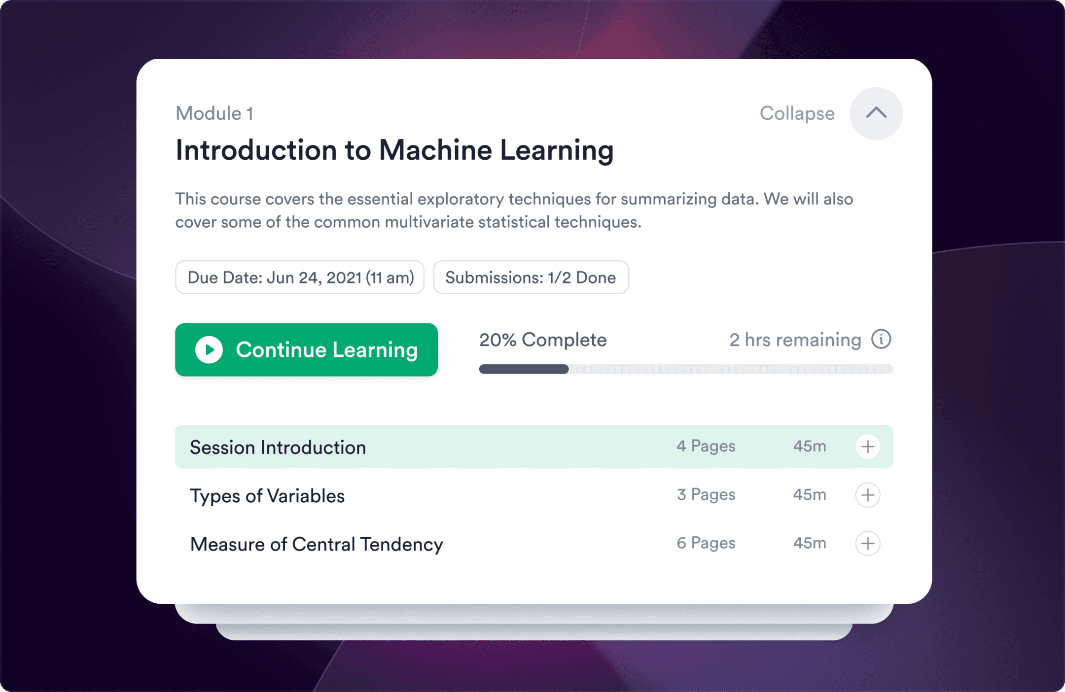
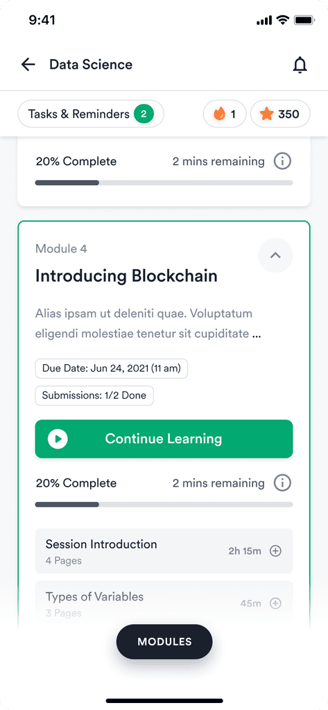
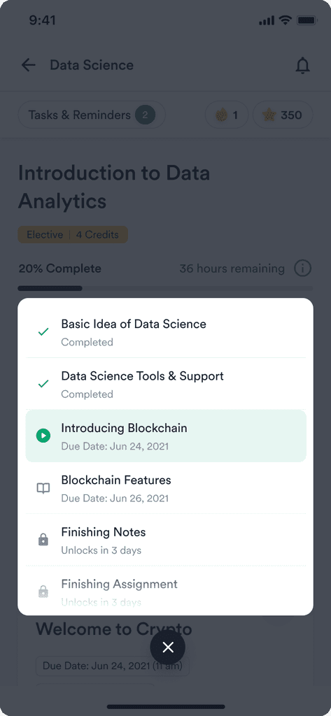
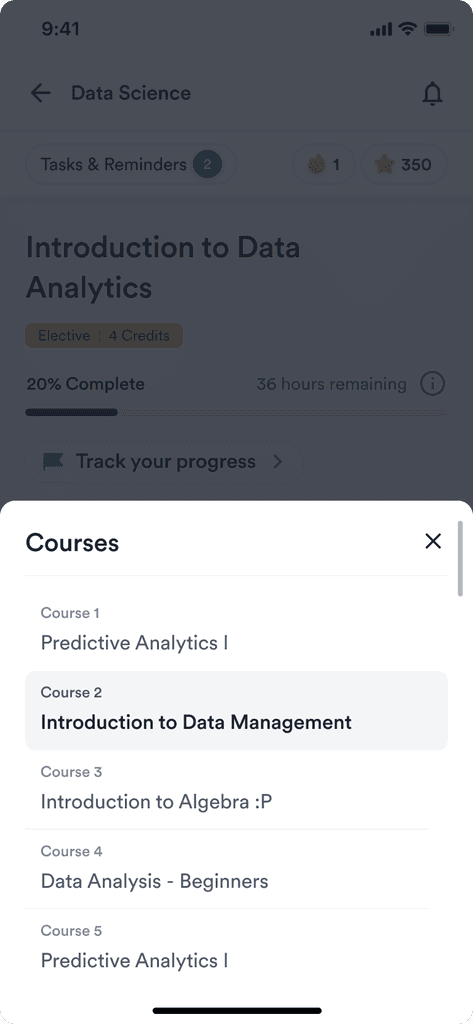
A Bird's-Eye View
The course content was designed to meet learners' needs for a clear overview, achieved through an intuitive module navigation system. Deadlines for assignments and exams were also made prominent to ensure timely submissions.
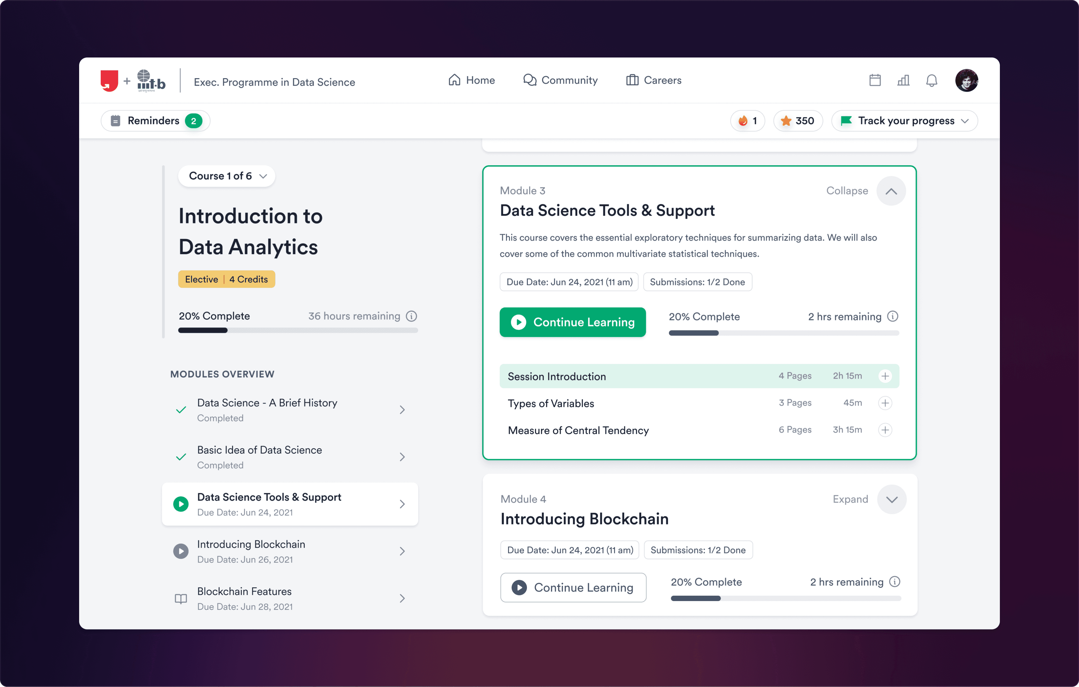
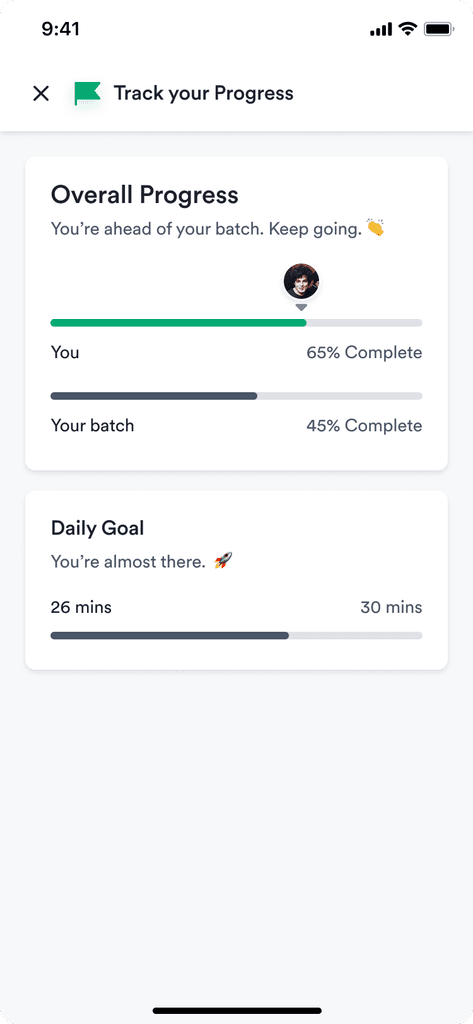
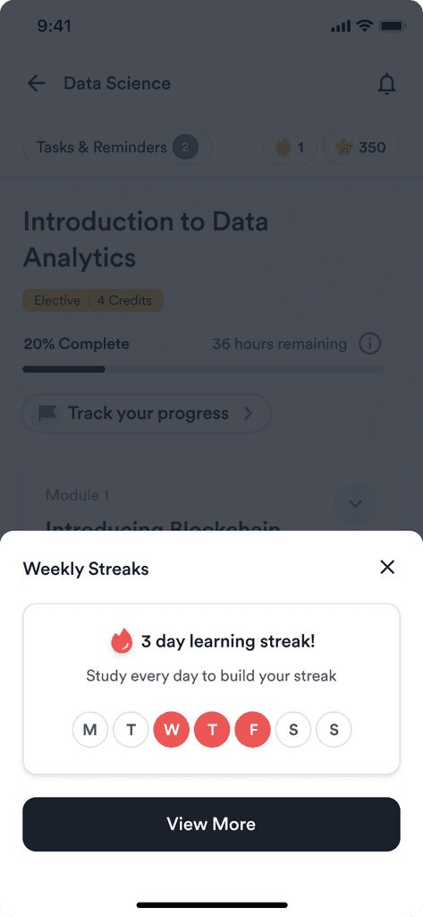
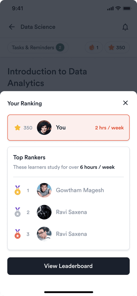
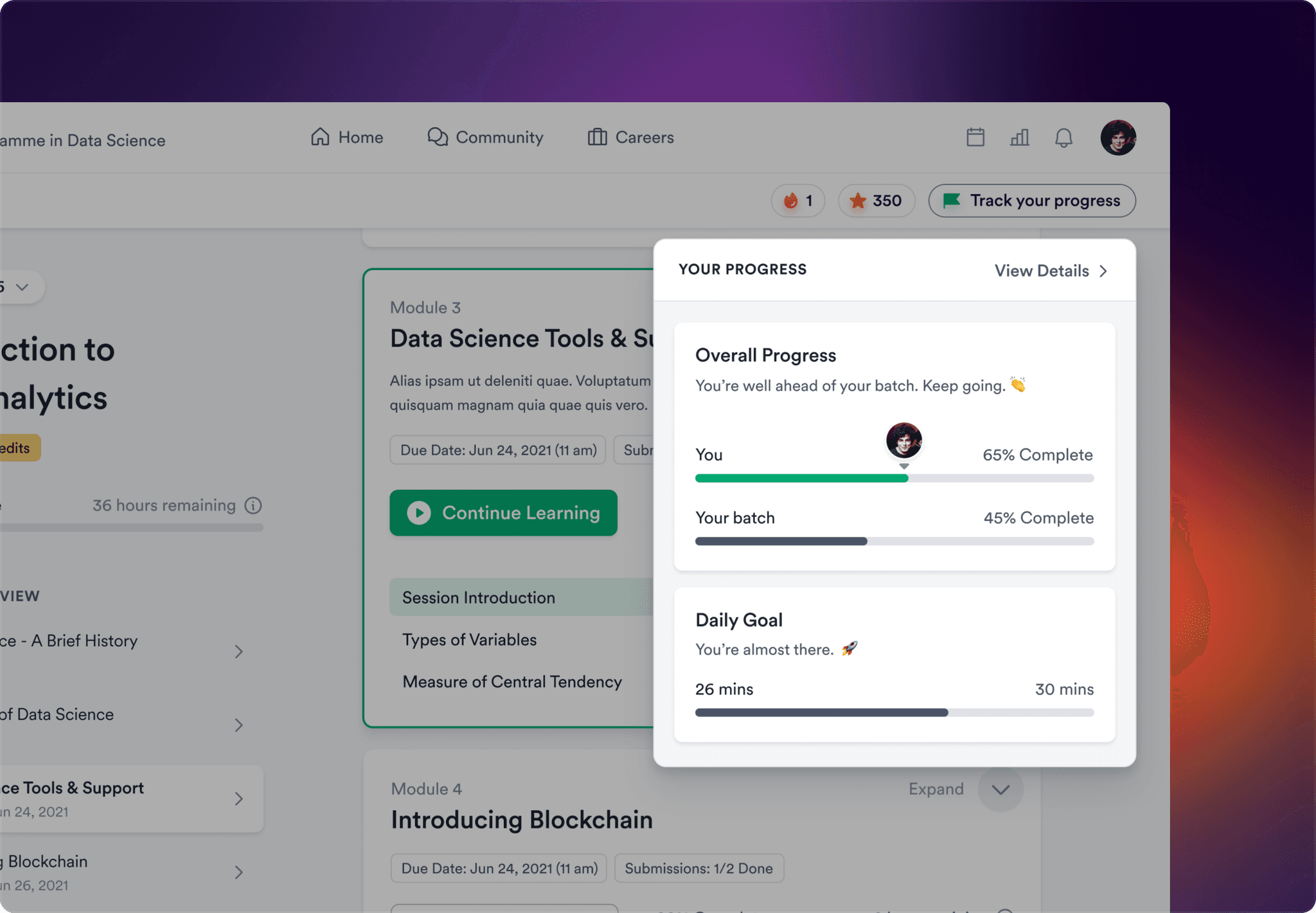
Timely Nudges & Progress Updates
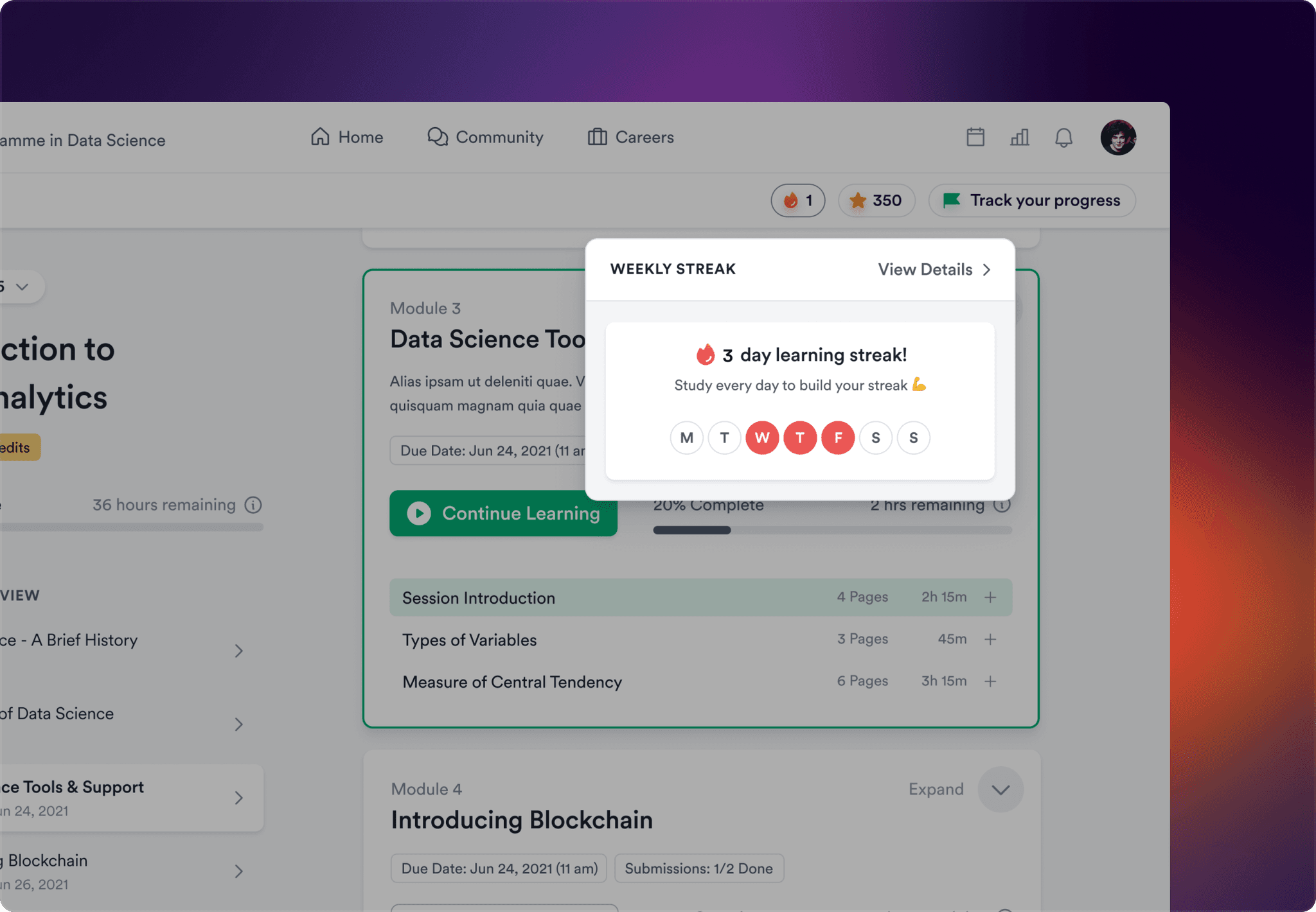
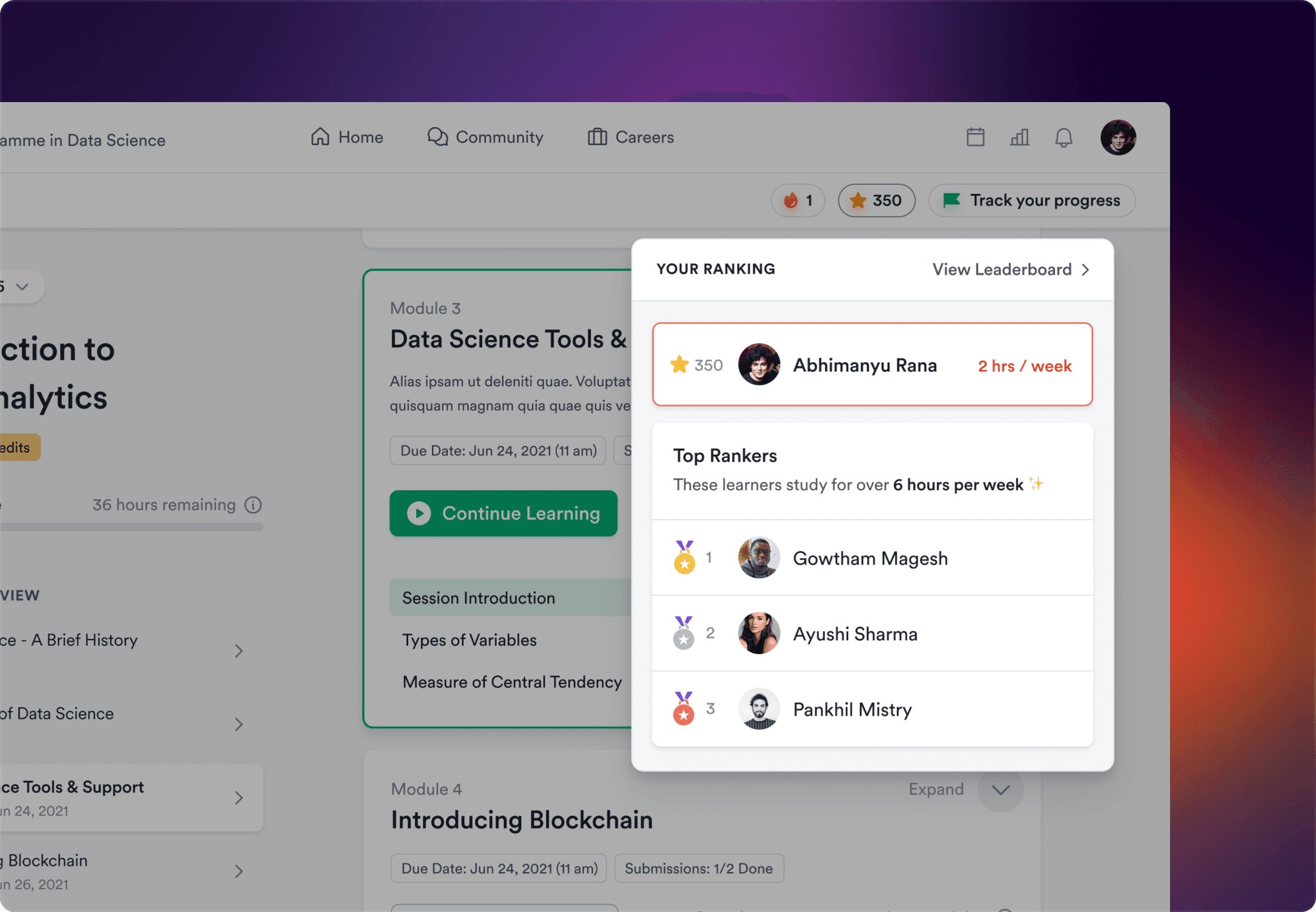
To increase stickiness and promote learner engagement, we incorporated features such as weekly streaks, peer rankings, daily goals, top performer stats, and timely nudges to prevent learners from falling behind on their course timeline.
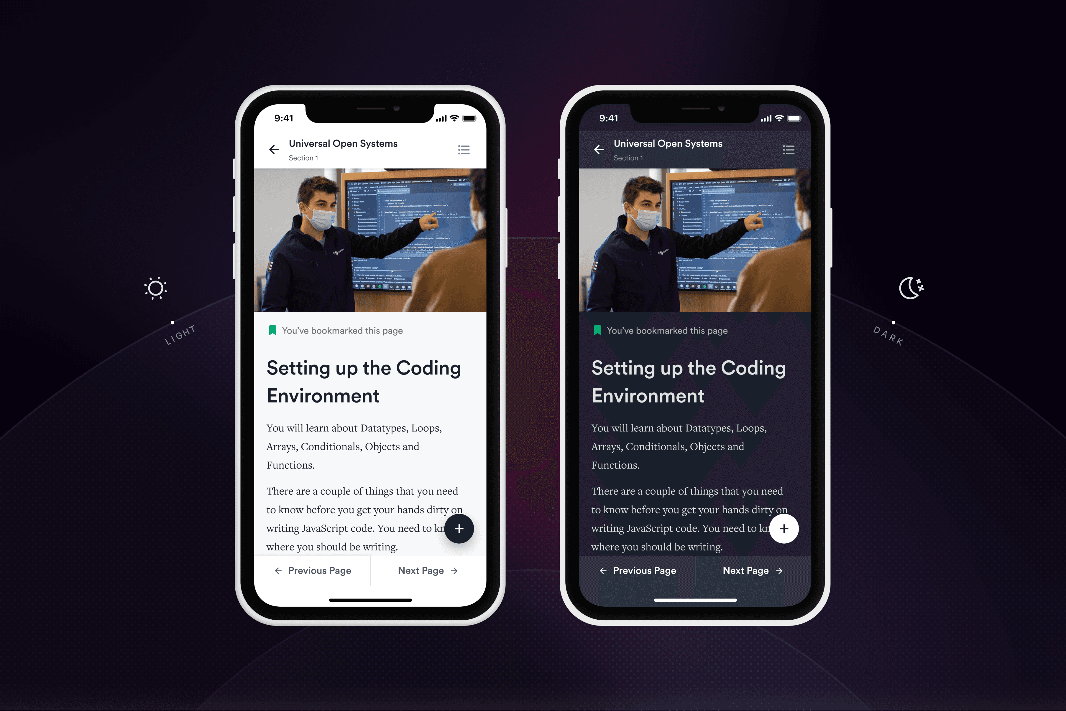
Mobile Learning
The mobile version of the learning app was created by scaling down the desktop version without sacrificing any features. Dark mode and accessibility features were also added to enhance readability for all users. Additionally, an offline mode was included to enable learners to access their course materials anywhere, even without an internet connection.
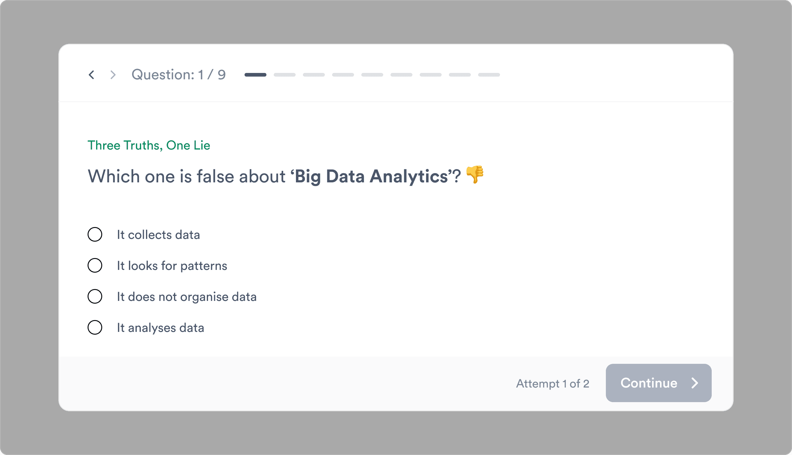
Quizzes & Assessments
To improve learning outcomes in our app, we followed a rigorous design process to create quizzes and assessments. This included identifying learning objectives, selecting question types, and testing content to ensure effectiveness. We did this to facilitate concept retention and provide learners with practical opportunities to apply their knowledge.
Visual Design
The Interface
We ensured visual harmony and user-centric design by prioritizing and organizing the information into primary, secondary, and tertiary levels of importance to the user. Moreover, to assist returning learners, we added a single "pick up where you left off" button on the homepage to help them resume their learning from where they left.
Consistent Language Across Devices
We prioritized designing for mobile to improve accessibility and user engagement, given the considerable number of mobile users on our platform. Moreover, to ensure consistency, we created a design system that could maintain functionality while adapting to smaller screen sizes.